Showing posts with label urban decay. Show all posts

Wednesday, 7 January 2015

Urban Decay Naked Basics Versus Naked Basics 2


I'm back!! With more eyeshadow palettes from Urban Decay!! Let's just get into it! After the holidays and with the Autumn and Winter season trends I had always been liking and using mostly warmer palettes all along but recently a sudden change happened. Not sure why or how but I'm leaning towards the much cooler tone palettes recently.

 Left: Naked Basics Right: Naked Basics 2

I'm not sure whether if you could tell that my Naked Basics Palette has been well loved in the picture above (there is already a dent and I think I'm hitting pan soon) but this is pretty much my go to palette if I do not know which or what shadows to use. I will always go back to the Naked Basics 1 or even 2 now!
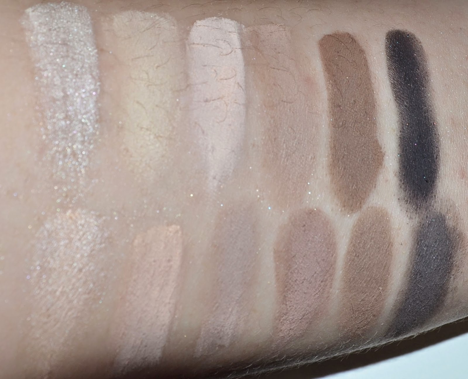
Top: Naked Basics From left to right: Venus, Foxy, W.O.S, Naked 2, Faint, Crave.
Bottom: Naked Basics 2 From left to right: Skimp, Stark, Frisk, Cover, Primal, Undone.

The difference between the 2 palettes is just that 1 is a warm toned palette and 2 is a much cooler toned palette.  I love both Naked Basics 1 & 2 a lot and in terms of choosing which palette to buy is entirely up to whether you prefer the much warmer tone shades or the cooler tone ones. The price of each palette here in Singapore is SGD $45 @ Sephora. The formula of these isn’t chalky and is of standard Urban Decay exceptional eyeshadow quality.

Naked Basics 
Venus:  Satin pale cream
Foxy:  Matte peachy beige (also in the Naked 2 palette)
Walk of Shame:  Matte pinky beige (comes with the 6-pan Build Your Own palette)
Naked 2:  Matte pale taupe
Faint:  Matte dusty brown
Crave:  Matte black-brown


Naked Basics 2
Skimp: Pale nude satin
Stark:  Nude pink matte
Frisk:  Warm grey matte
Cover:  Muted red-brown matte
Primal:  Muted brown matte

Undone: Deep, Smokey brown matte

If I'm really force to choose I'll still get the first one, it is just a habit that I'll still love my warmer shades I guess to be on the save side. Either one Palette would be well-loved in anyone’s makeup bag, so which one you prefer?


Wednesday, 5 November 2014

Urban Decay: Vice 3 Eyeshadow Palette


Hi Ladies,

There are tons of palettes releases in the holiday season and this year Urban Decay's Vice 3 palette looks the most tempting for me. At least I know I'll definitely use this palette because I love the shades in here.


Urban Decay Vice3 Eyeshadow Palette
 (SGD $88 for 0.60 oz.) contains twenty new, limited edition, and exclusive shades. Overall, the palette had good color payoff with the majority of the shades. I do not have any issues with the textures like other bloggers or vloggers, even if there is a few shades that is quiet powdery so you'll want to be careful applying them (there is an old trick that last time makeup artist use to used is just use a fan brush and apply more loose powder underneath our eyes, after we finish the eye makeup just brush off all the excess powder and that will just simply solve all the problems easily).

This is also a more warm-toned palette with a lot of mid-tone and dark shades, and as I worked through the palette, I felt like I needed a couple of lighter/light-medium shades so that not every eye was dark and smoky. I can't compare with the previous Vice 1 & 2 because I didn't get them (Not interested in the colours in previous palettes).

This palette includes a thin, zippered bag that you can store the palette in (or, whatever you’d like).  It is metallic, so it holds fingerprints very easily. The included double-ended brush seems to be of the same quality as other Urban Decay brushes, which is all right.


Truth is described as a “pale pink-nude matte.” It’s a light, neutral-to-warm-toned pink with a matte finish. It is 1 of the more powdery shade. It is really pigmented, and this is a great shade as a brow bone highlighter. 

Undone is described as a “pink-beige matte-satin ” It’s a light-medium, peach-beige with warm undertones and a very fine shimmer over a matte finish. It really just looks matte on the lid. It had decent color payoff with a very soft, silky texture, but it was slightly powdery.

Downfall is described as a “warm light brown matte.” It’s a medium, warm-toned brown with a matte finish. It had decent pigmentation with a soft, silky texture and a little powdery to work with but blend very well on the lids.

DTF is described as a “taupe matte with subtle pearl finish.” It’s a medium-dark, neutral-toned taupe with a satin-matte finish. It looked mostly matte applied on the skin, but the shimmer in this shade was more noticeable than in other shades with a similar finish. It had good color payoff.

.


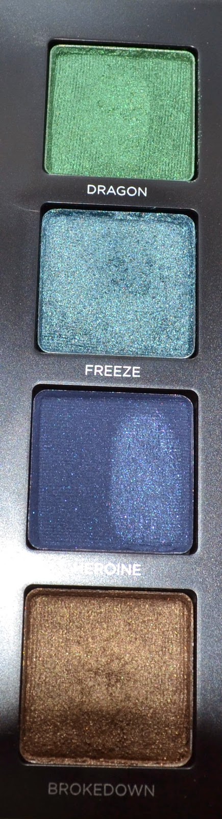
Dragon is described as a “bright metallic green shimmer.” It’s a brighten medium grassy green with warm, yellow undertones and a pearly sheen. It had fairly good color payoff, and the texture was smooth, though thinner.

Freeze is described as a “metallic medium blue with multidimensional micro-glitter.” It’s a muted, medium blue with a golden, metallic finish. It had fairly good pigmentation, though the texture was slightly dry/powdery. 

Heroine is described as a “deep navy blue with subtle pearl finish.” It’s a blackened navy blue with silver and navy blue micro-shimmer over a matte finish. It’s more pigmented than it appears, but it doesn’t stick well to bare skin and blends away easily, so remember to use a primer. The texture is a little dry and fairly powdery. 

Brokedown is described as a “metallic golden brown shimmer with gold micro-glitter.” It’s a golden, olive brown with hints of green and warm undertones and a metallic finish. The texture was soft and dense, it had intense color payoff. 


Vanity is described as a “smoky metallic eggplant with multidimensional micro-glitter.” It’s a medium-dark, plummy purple with warm undertones and a pearly sheen. It had nice color payoff, and the texture was soft and only a little powdery. 

Lucky is described as a “metallic bronze.” It’s a brightened, frosted copper with warm, orange undertones. It had excellent color payoff, and the texture was soft, smooth, and buttery.

Reign is described as a “rich brown satin.” It’s a medium-dark brown with a frosted, golden sheen and warm, yellow undertones. It had good color payoff with a softer, smoother texture. 

Bobby Dazzle is described as a “metallic white with pale gold micro-glitter.” It’s a warm-toned, white gold with a metallic sheen and fine micro-glitter. The glitter doesn’t seem noticeable applied so much as it seems to give the powder a grittier, drier texture that doesn’t feel as smooth. It had fairly good color payoff at least.


Alien is described as a “pink-peach with golden shift.” It’s a light-medium, yellow-toned pink with a soft, golden shimmer. It had good pigmentation, but the more powdery texture made it harder to apply. 

Alchemy is described as a “deep fuchsia satin.” It’s a darker, pink-berry with warm, reddish undertones and a pearly sheen. It had good pigmentation, and the texture was smooth and blendable.

Bondage is described as a “deep, smoky burgundy shimmer.” It’s a rich, dark purple-burgundy with warm undertones and a metallic sheen. It had excellent color payoff, and the texture was smooth, buttery, and blendable.

Sonic is described as a “metallic red-copper.” It’s a brightened, medium-dark orange-red with warm undertones and a frosted, metallic finish. It had excellent pigmentation, and the texture was soft, smooth, and buttery.
.


Last Sin is described as a “champagne shimmer with silver micro-glitter.” It’s a light, warm-toned beige with a metallic sheen. The glitter is most noticeable in the pan, but the majority had dropped while I was applying it.

Angel is described as a “light taupe with silver micro-glitter.” It’s a light-medium, golden taupe with warm undertones and a metallic sheen. It had so-so color payoff, but it had a drier, firmer texture. I didn’t notice any micro-glitter in this shade.
Defy is described as a “smoky taupe satin.” It’s a dark, cool-toned taupe that leans more gray than brown with a matte finish. In the pan, there are very tiny micro-shimmers, but it appears matte on the skin. This is just okay for me.

Revolver is described as a “soft black satin with subtle floating iridescent pearl.” It’s deepened, charcoal gray with cool, bluish undertones and a silver shimmer-sheen finish. It had nice color payoff, and the texture was fairly soft and smooth.